
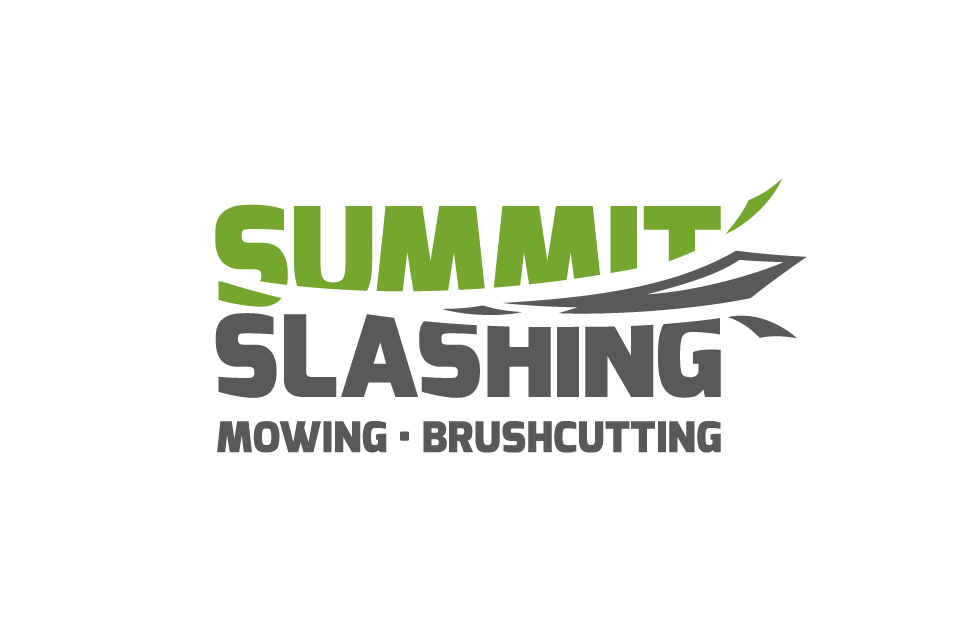
The logo is designed to be bold and readable with a sense of energy. The tightly stacked layout results in a neat, rectangular form that is easy to apply to any common need.
The logo works well inverted and can be simplified through the exclusion of the services line.
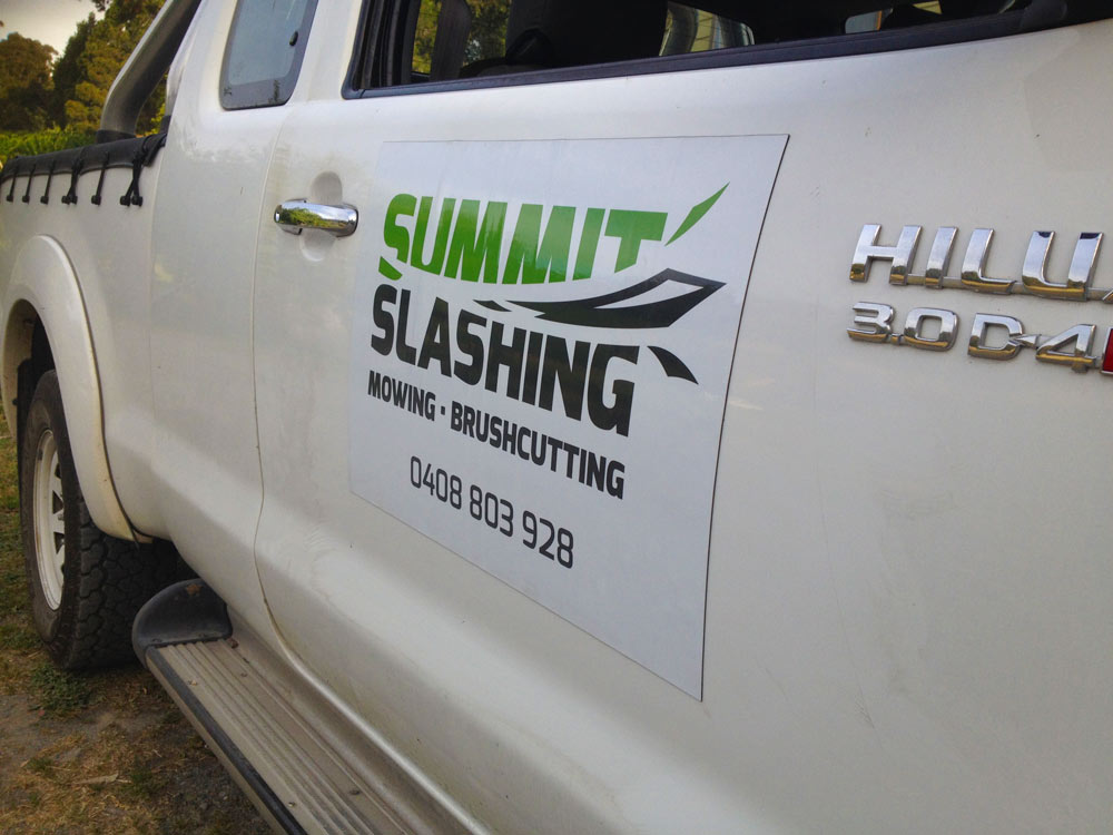
2x door magnets were designed and sourced. These were used daily for a couple of years until Andy swapped to a non-white work vehicle.
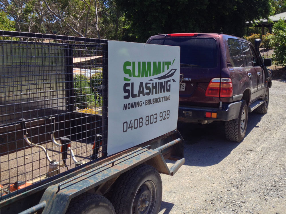
The trailer signs are printed in a UV-stable manner on Dibond.

I designed and sourced this trailer signage at the same time as the vehicle magnets.
What self-respecting graphic designer doesn’t love doing free work for family members? When my brother Andrew started a mowing, slashing and brush-cutting service, I declined to let him enter the market without first letting me design him an identity to be proud of.
Applications so far include business cards, vehicle magnets, trailer signage, invoices and a simple A4 flyer.