

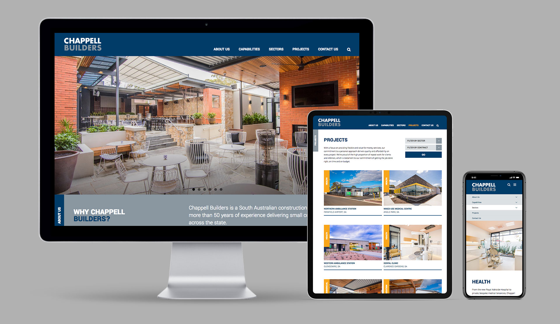
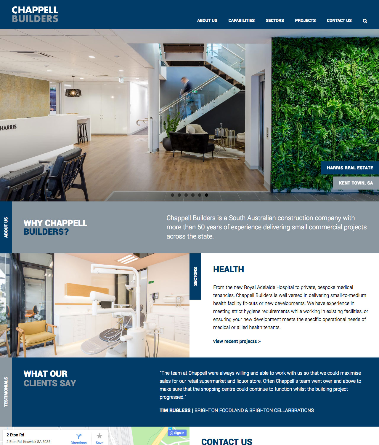
The home page was designed with three (!) separate slideshow elements. On consultation with the designer, one trivial one was changed to a static but randomly-loaded content block while the other two change at different intervals to avoid looking like one giant unit.
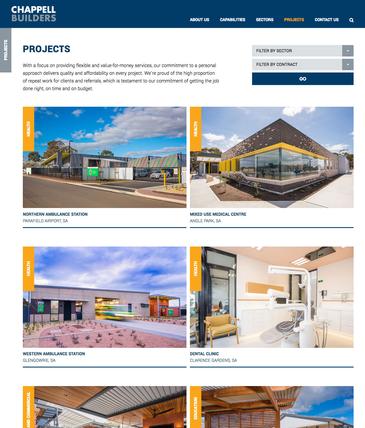
The projects section features filtering powered by custom taxonomies.
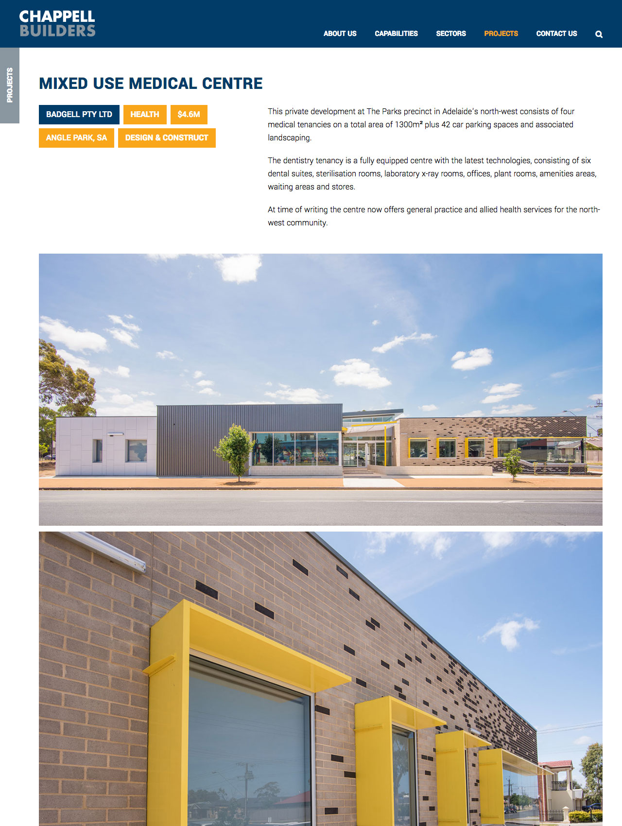
The tags in the top, left corner are a mix of custom fields and taxonomy terms.
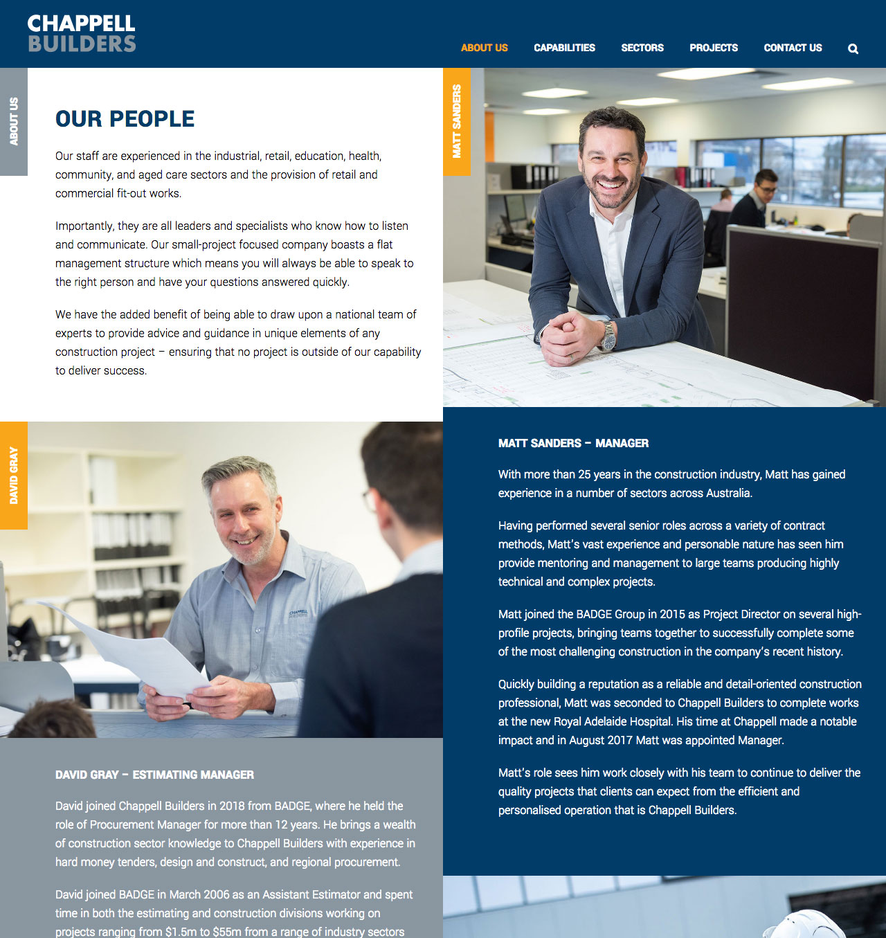
Like the sectors page, the people page uses CSS flexbox layout combined with the Fusion Builder block editor to reorder elements for smaller screens while being editable by non-technical admins.
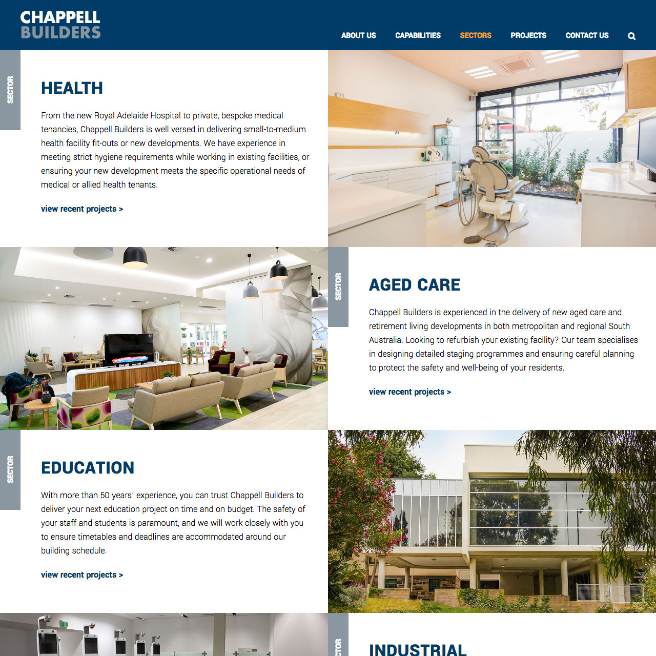
The alternating structure of the items on the sectors page presented the problem of single-column reflow on mobile devices. Flex order was used to achieve the desired layout on desktop while avoiding seeing two images in a row on mobile.
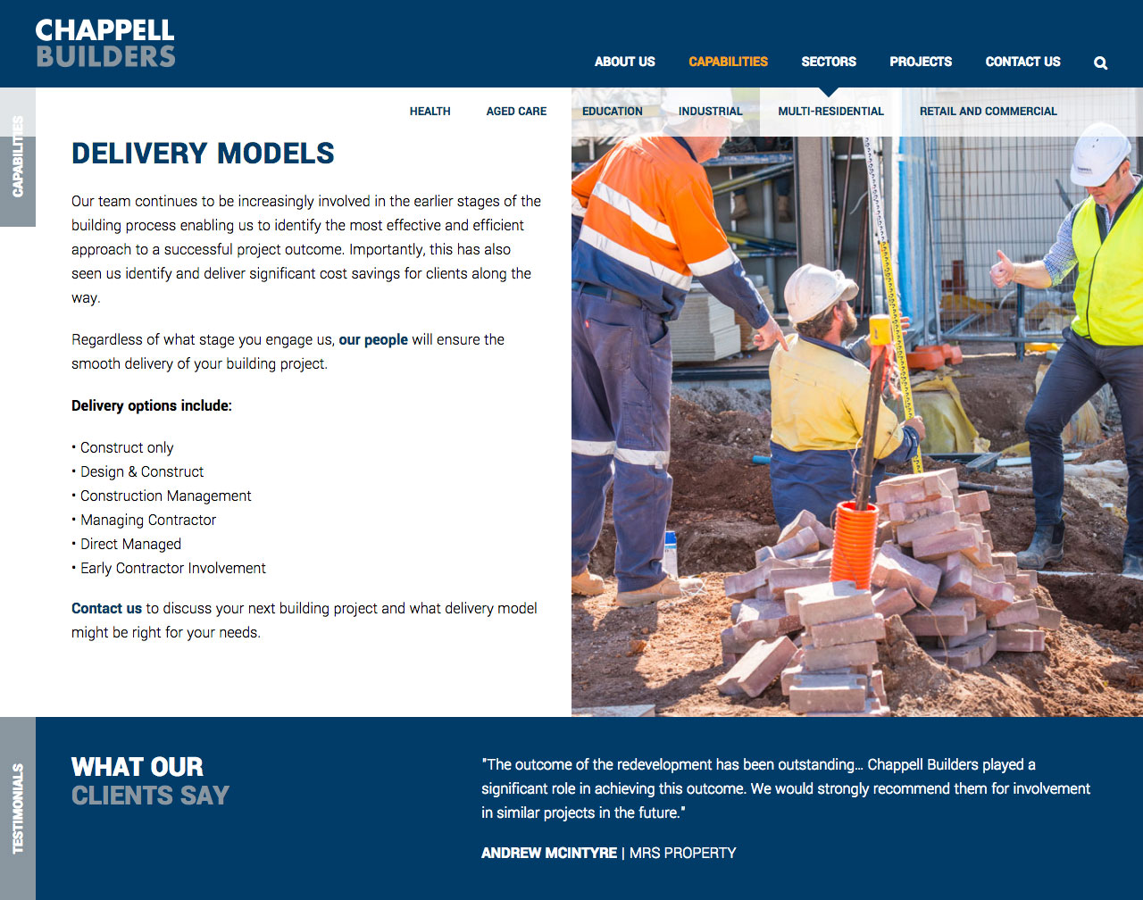
The horizontal drop-down menu was an interesting challenge wo achieve using only CSS on top of the Avada parent theme's menu markup.
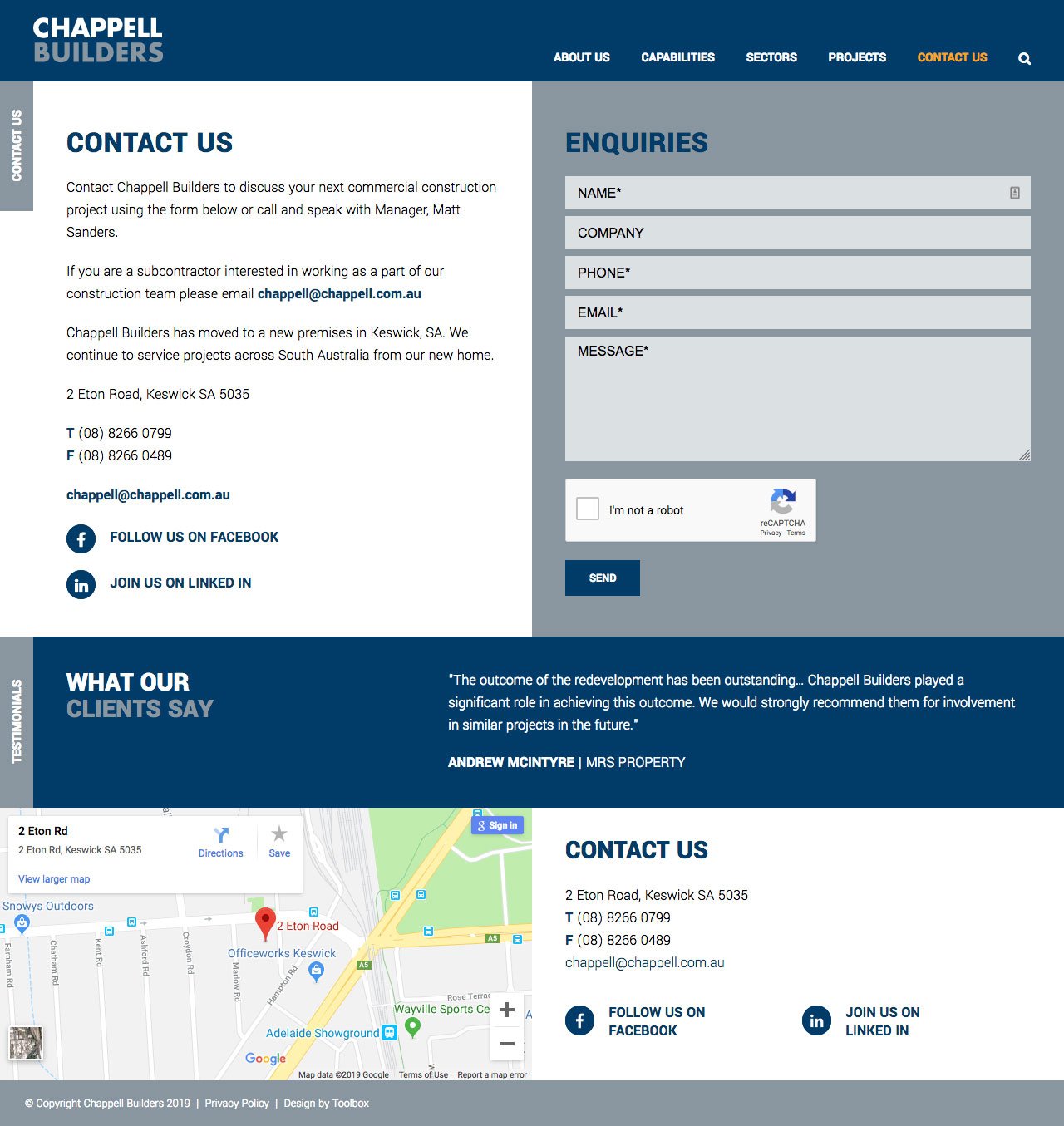
The contact page includes a form protected by reCAPTCHA. The footer features a Google map, contact info and a randomly selected client testimonial.
A shiny, new WordPress website for Chappell Builders with a build focused on performance and ease of management.
As a subsidiary of BADGE Constructions, the Chappell website was to be partially administered by the same marketing team. Fortunately a number of the components I created for the BADGE site could be easily re-used here, saving time on the build and making for a more seamless experience for editors jumping between the two sites.
In a number of instances image elements have been used for their better search performance while employing clever CSS to achieve visual enhancements more commonly seen only on elements using background images. Image elements make use of the srcset attribute to only load as big of an image as needed for the device rendering the page.
Horizontal drop down menus were an interesting challenge to get looking just right due to the mark-up generated by the parent theme. While I could have overridden that, a CSS-only fix was the more future-proof approach.
In fact the design featured a few out of the box details that required experimentation and novel workarounds to achieve cross-platform consistency. Notably, the deceptively not-simple vertical titles and images that in places need to both be inline with text content and able to stretch to the edge of the screen, beyond the content column
Designed by Bridget Milson at Toolbox Design.