The client's main focus was getting a website up and running but also needed a simple, classic identity to make it his own.

Business card artwork was designed and prepared for the client to have printed at a future date. This is a stock image mock-up.

The focal point of this project was a WordPress website to host a blog and act as an online business card for Peter Gardner's industrial consultancy.

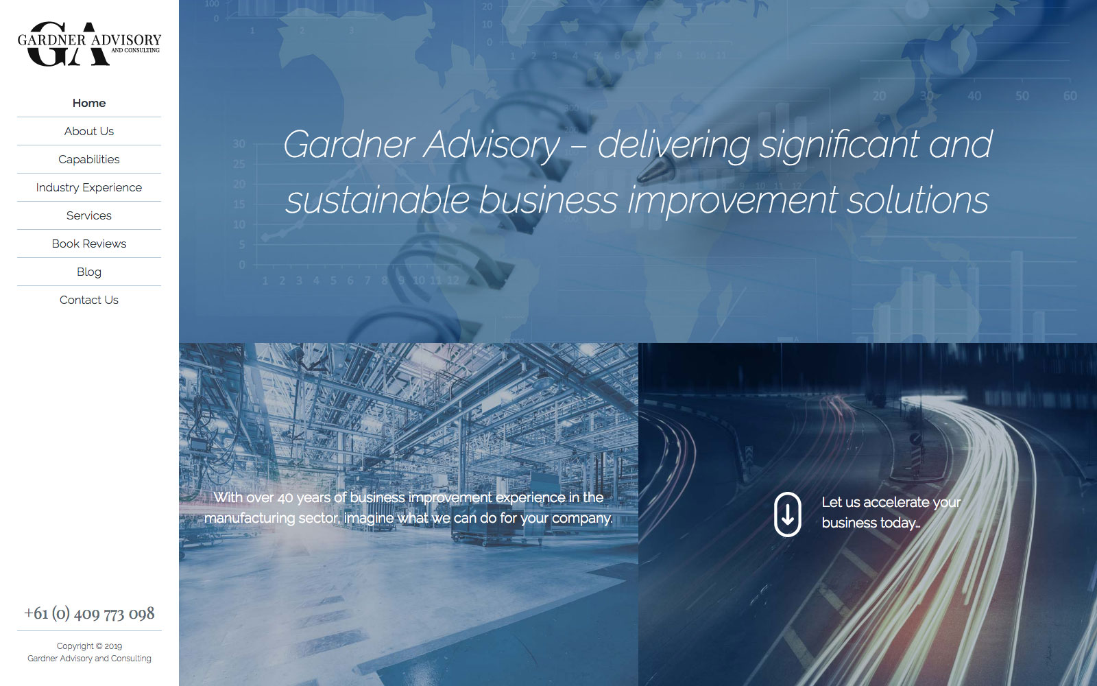
The website is mostly on one long-scrolling page consisting of one, full-height panel per section. Most menu items simply scroll the desired content into frame.

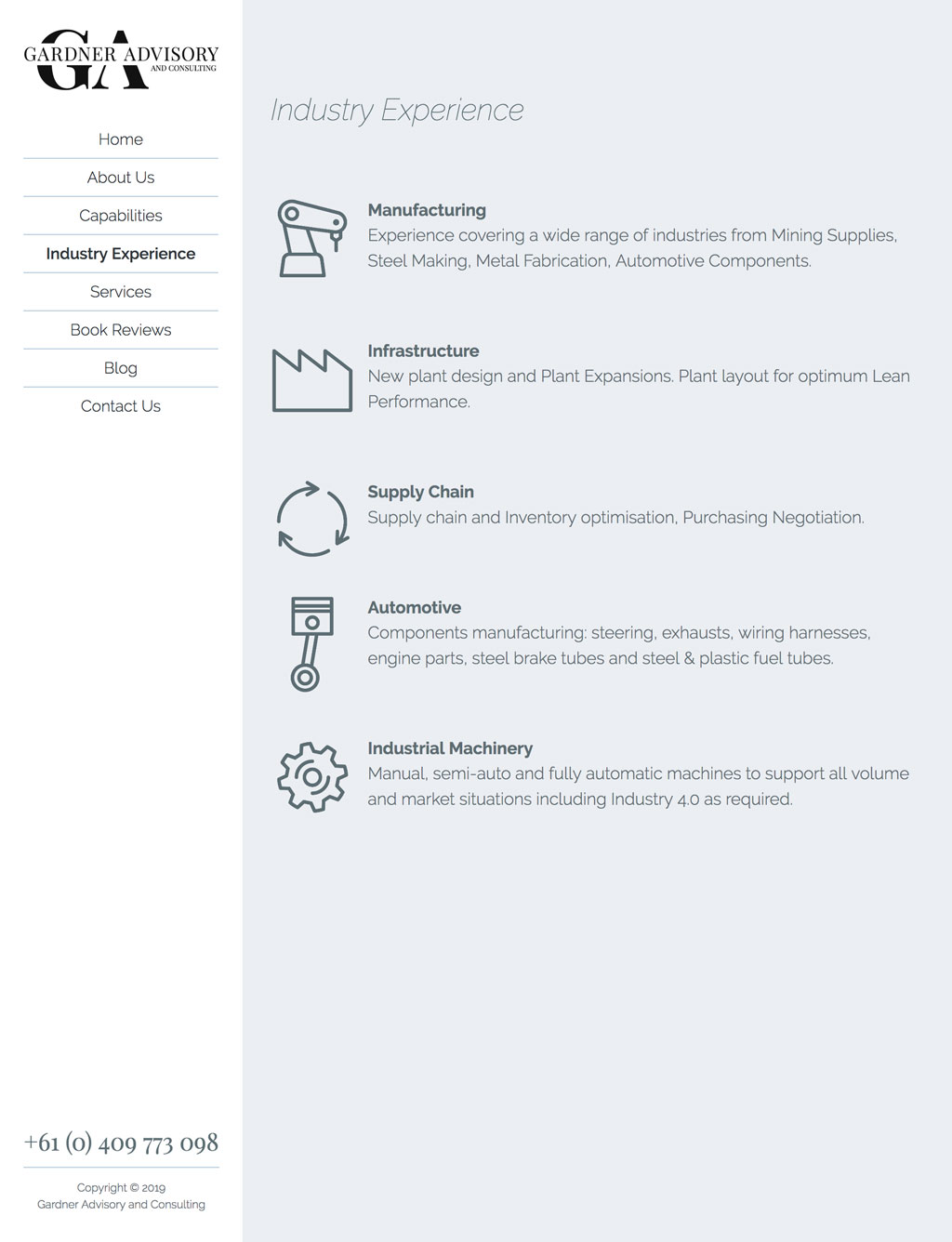
Some areas includes icons custom-designed for this site.

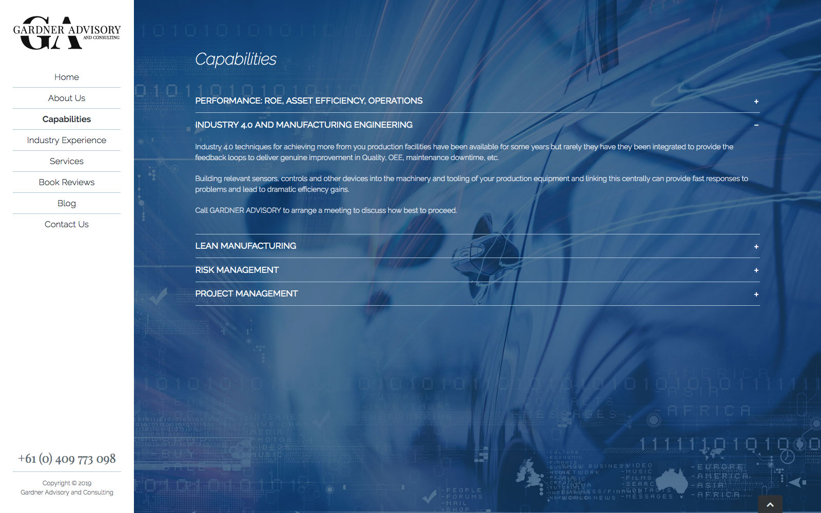
Parallaxing background images and toggling content blocks lend a modern, innovative feel to what could otherwise have been a bland brochure website.

The site acts as an online brochure and business card for the client, showcasing his experience and abilities for prospective clients.

A blog is also included to give the client a space to add further content that doesn't necessarily belong on the home page.
Peter Gardner was recommended to me by another client for a cost-efficient website design and build. A simple identity and business card development were also within the scope of the project.
The brief was to create a very modern looking and capable website that would act as an online brochure for the client’s industrial consultancy business. UI design should be slick and contemporary but with a more “classic” approach to the brand.
The business cards were designed to be printed in Pantone 5405 C though a metallic foil or ink were also recommended if something a bit more special was desired.
The build process also involved advising on suitable hosting and getting the client set up with a domain name and branded email box. I also aided in configuring laptop and mobile email software.

