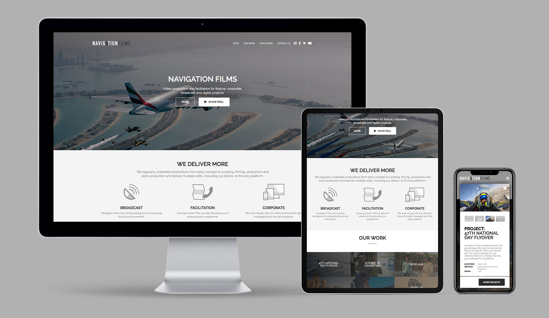
This is the third website iteration I've created for Navigation Films.
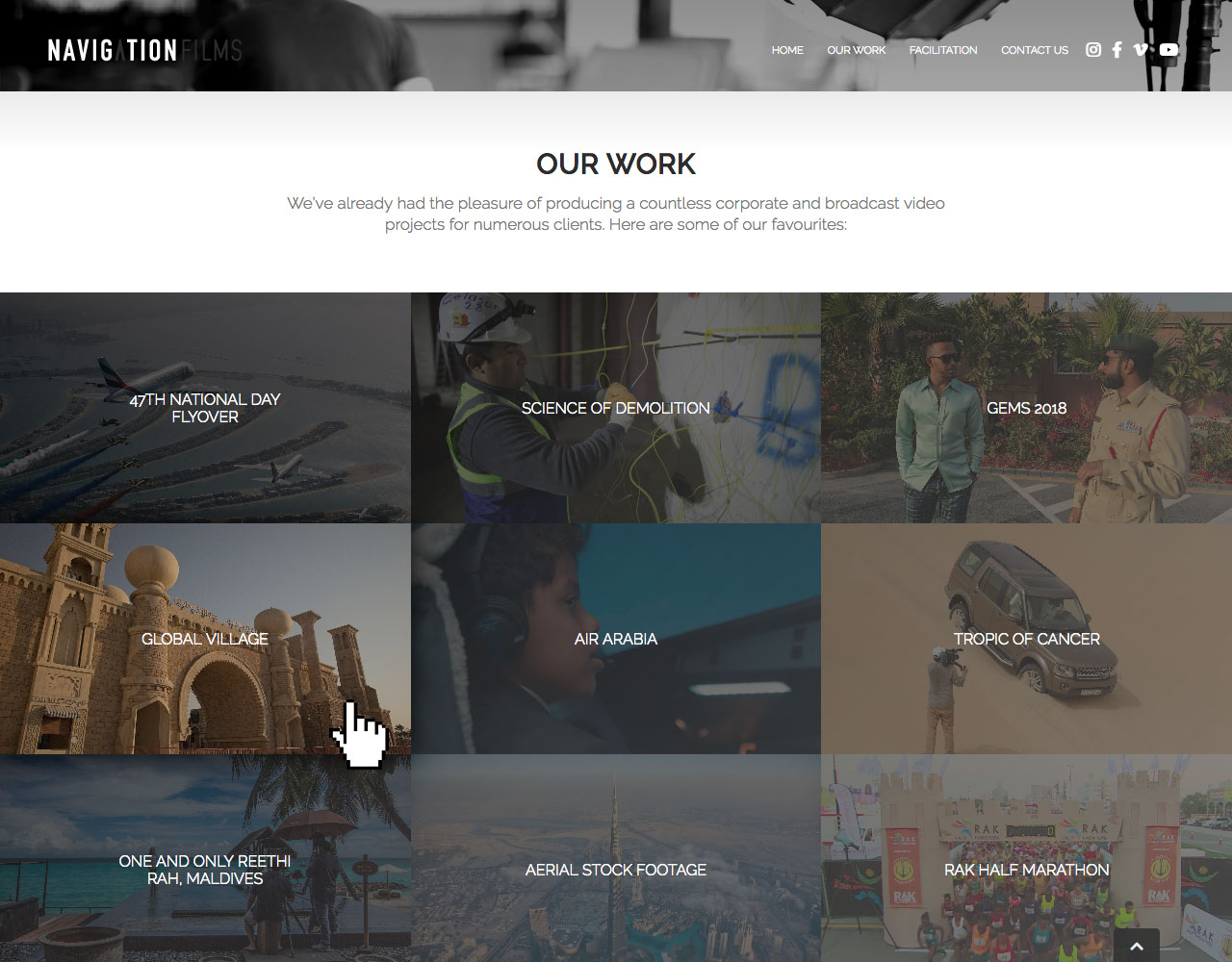
Hover states transition an image zoom, opacity and a dark, soft shadow to create a stylish effect without taking from text legibility. Thumbnails are 16:9, a common video aspect ratio.
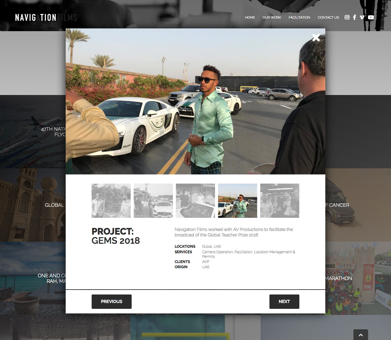
Projects animate open and dynamically load any embedded videos in a gallery that can combine still images, YouTube and Vimeo content all in one place. That's Lewis Hamilton, FYI.
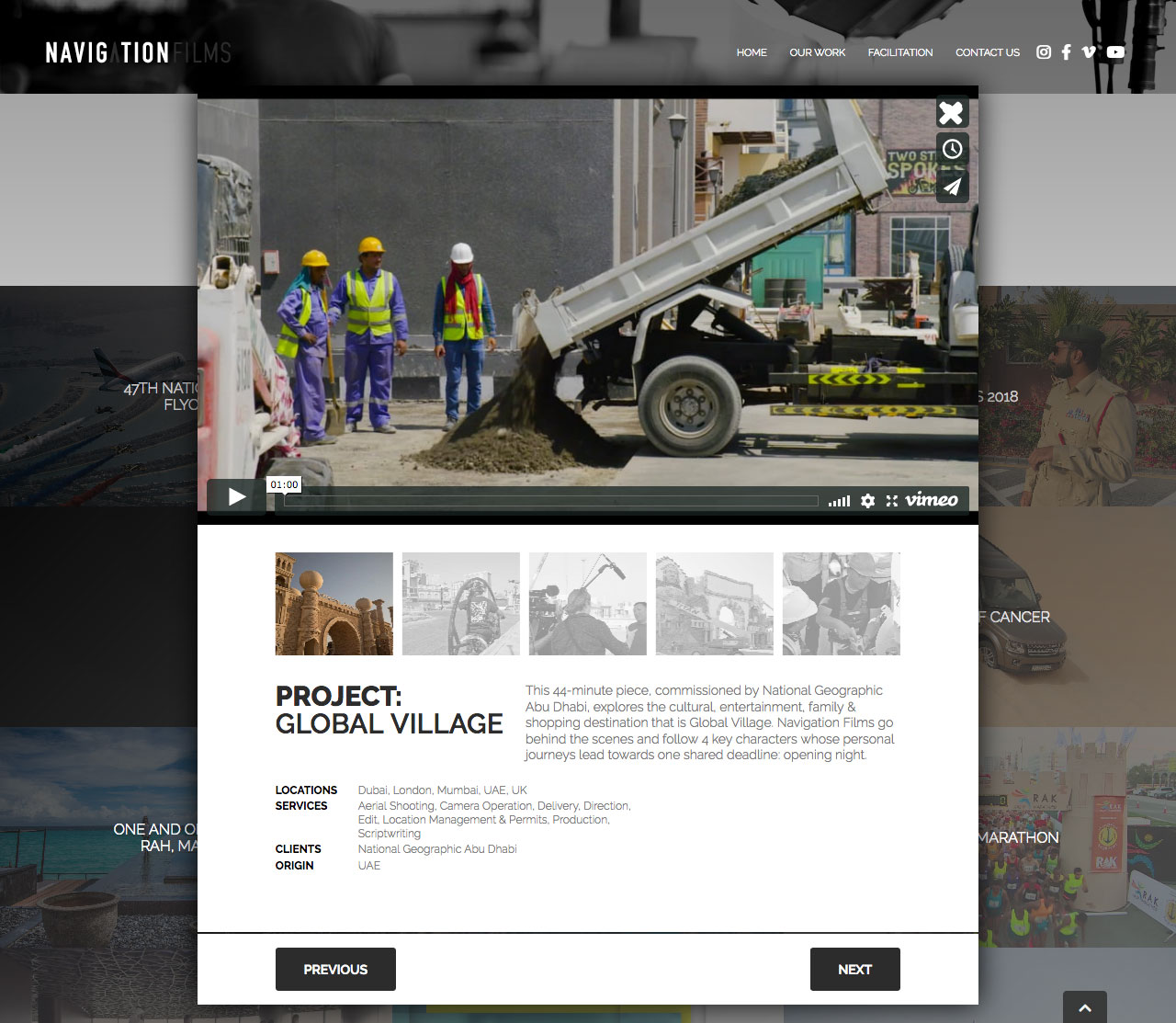
Showing a Vimeo embed. The letterboxing is a side effect of the video being an odd aspect ratio. Most are 16:9.
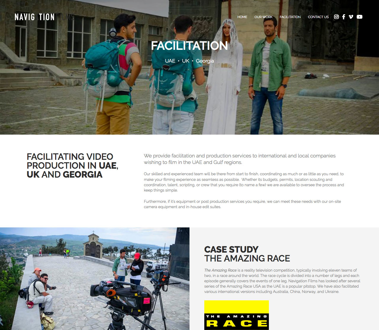
The Facilitation page uses the same portfolio componentry as Our Work while also making use of the site's block content manager to structure static content in an interesting manner.
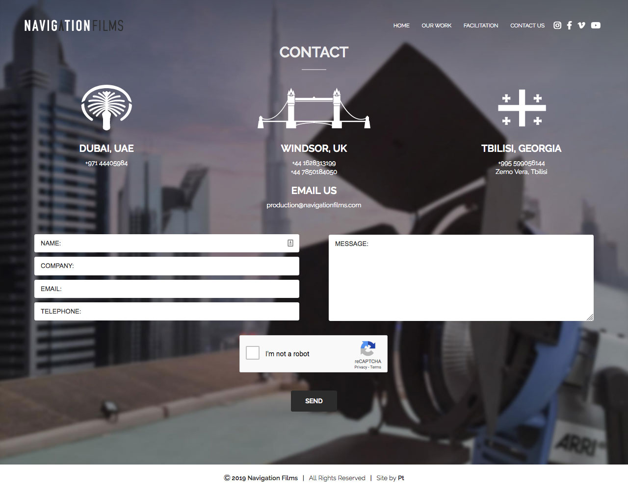
Navigation Films contact page featuring a contact form with reCAPTCHA spam protection. The three location icons were more of my creations.
Another freshen-up of the WordPress website for Dubai-based Navigation Films. This time with more focus on their portfolio of recent work and extensive use of custom-built interactive UI components.
It was a great opportunity for me to play around and learn a bit more jQuery and experiment with transitions between static and active states. Unfortunately a couple of my favourite parts had to be hidden at the last minute in an effort to combat staff poaching by competitors.
The design and build was all my handiwork. Features include custom fields, a block editor, parallaxing background images and dynamically loaded page content to name a few.

