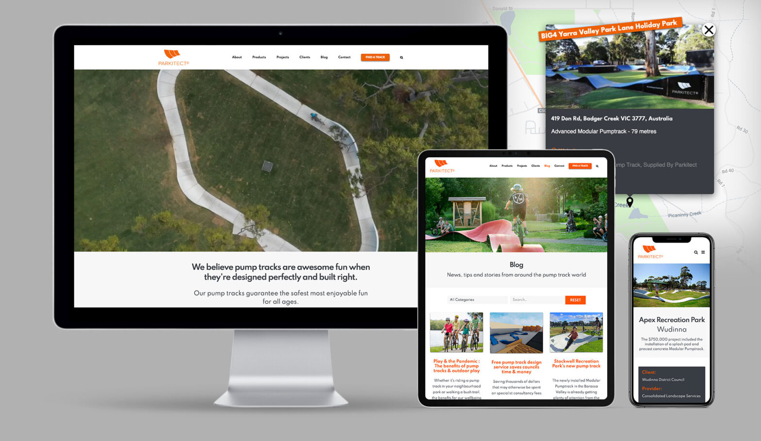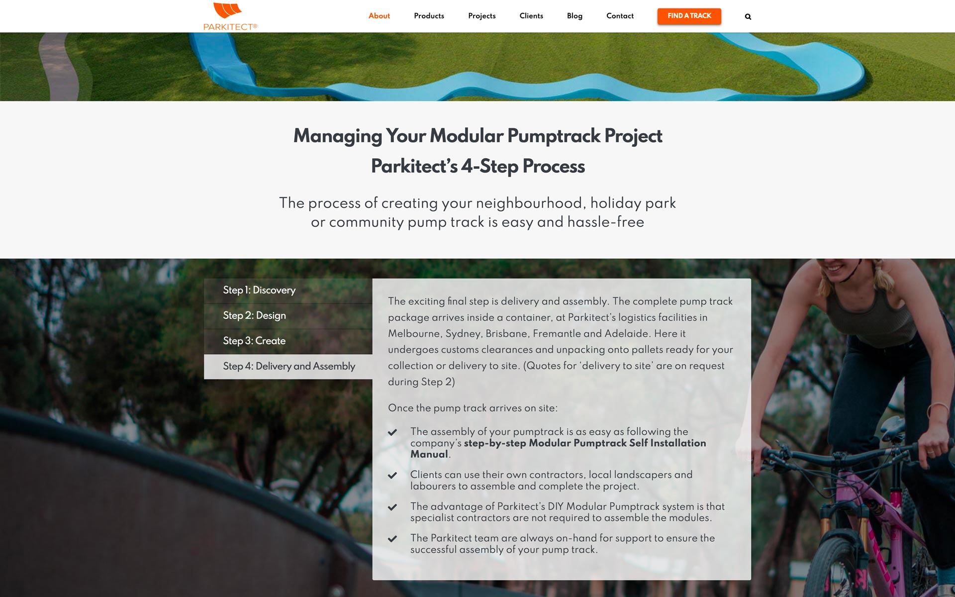
Parkitect 2021 Website - About page with custom-styled tabs
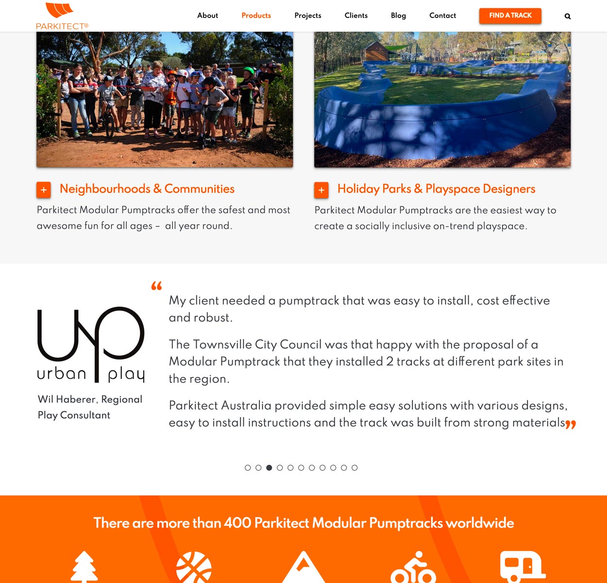
Product page showing testimonials and closed toggle elements

Product page showing open toggle elements

Particular attention was paid to the presentation of the contact form given the request for it to present in the global footer
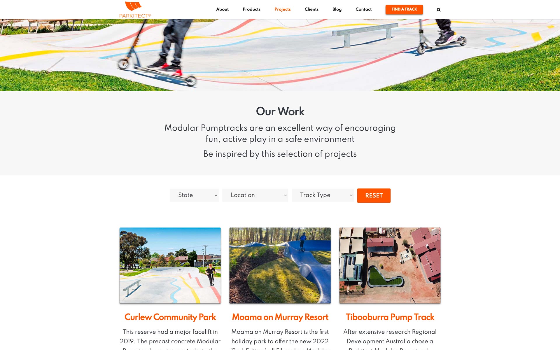
Our Work archive with filtering – this layout is also used for the blog archive
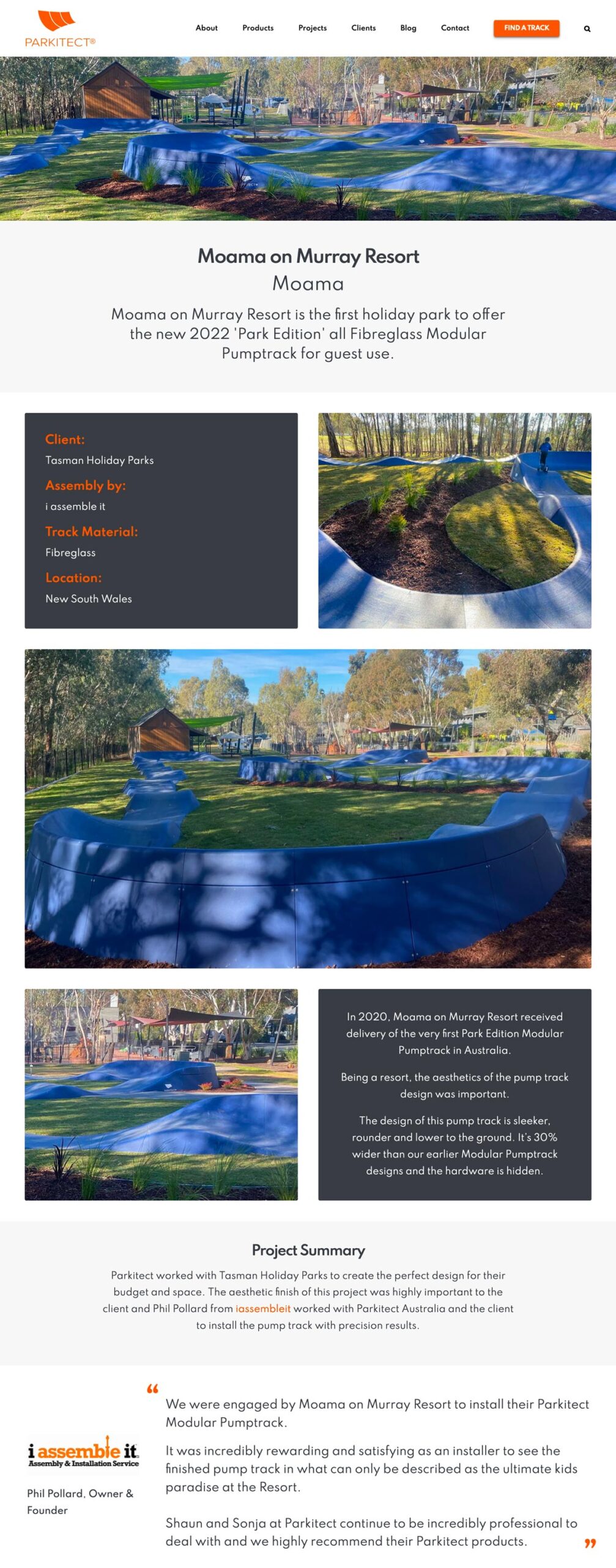
Our Work single project example used as a template for all projects

Parkitect's track finder was split out into pumptracks.com.au and turned into a general listing of pump tracks across the region. It features filtering, seach and a custom-styled Google Map. The contact form means it is still a lead generator
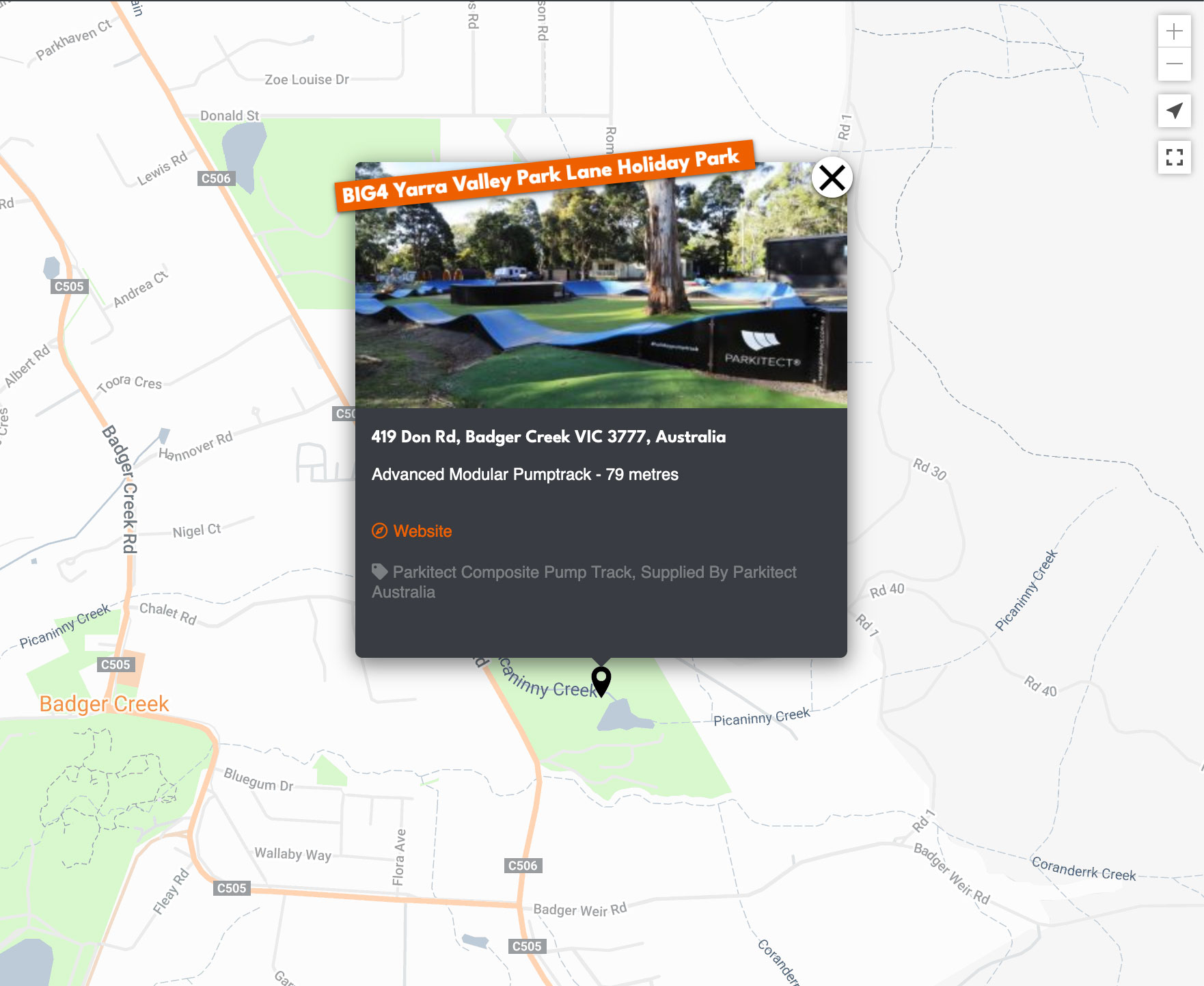
The info window with a subtle touch of custom CSS animation
In 2021 I worked with Parkitect Australia to take their website in a fresh, new direction. The previous site was a build only job with excellent design work courtesy of Toolbox.
After several years of gradual modification, a change of name and a shift of target audience, the old site was no longer fully saying what Parkitect wanted it to and they decided it was time for a freshen up.
With Toolbox’s blessing, I took on the redesign as well as the build. The client had a clear idea of what they wanted and the design process came off very economically.
The new site takes full advantage of larger screens while also delivering a much cleaner navigational experience, condensing three previous menus into one. The content of the site was largely re-worked to best target their current, ideal audience and generate high relevance enquiries.
This new focus also led to the concurrent creation of a new, sister site in pumptracks.com.au. Splitting the old track finder out into its own site allowed much more content flexibility, now listing pump tracks from any installer and enhancing its usefulness for the community.
This change came off without a hitch despite the decision being made while construction of the main site was already underway.

